Hi , welcome to issue #11 of the Tasart newsletter. Finally, spring seems to be in the air with each day growing longer. Our streets (and shop) are suddenly filled with lovely accents, as Takapuna Beach is hosting the French Rugby team so, All Black fever is also in the air. The French team are staying directly behind our shop and we can hear them when we're painting in the studio at night and at The Saturday Workshop. Many of our customers are taking advantage of the sudden influx of tourists and are selling their Kiwiana art around town so tourists can take a bit of NZ back home. Good luck to everyone during this once in a lifetime opportunity, in showing the world our sporting and artistic prowess.
Product Spotlight
Plein Air Tools

Our very popular Pentel Color Brush Pens are back in stock along with the new arrival of a selection of Strathmore Visual Journals; the perfect Plein Air companions. The Pentel Color Brush pen has a nylon brush tip and is ideal for painting and sketching on location. It contains a refillable water-based ink that flows easily, dries quickly, and produces transparent watercolor effects. Strathmore Visual Journals feature high-performing papers, heavy-duty covers, and a durable wire binding that help artists reflect, explore, create, and mix it up.
Designed to meet the intense demands of the artist's creative process, Visual Journals feature heavy-duty covers with spiral wire binding that is thicker and stronger than traditional bindings. The journals lie completely flat for ease of use.
Thank you to our customer, Elaine, who introduced us to the Strathmore Journals so we were able to source and import them.
Le Stig test-drives products & reviews
"A poor craftsman blames his tools."
There is so much misinformation and half-truths out there, it can be pretty confusing for the artist. Since the majority of art supply stores in New Zealand own product agencies (which we do not), we've decided to commission a 'tester' who will test products and give unbiased opinions and results. This month, our 'Technical Support Champion' is back by popular demand, test driving some economically priced oil pints and sharing with us some tips on how to paint like a pro without draining the bank account. Here are the results:
"Learning the essentials of good painting does not have to be expensive. all good paintings have three things in common and in order of importance and they are, 1) good composition, 2) good contrast and 3) good colour. In Atelier our instructors were aware that most students had little money for supplies, so the materials lists were made with that thought in mind. We were never required to paint on expensive canvas or use expensive paint. We were novices and our initial efforts often went from easel to bin. What a waste that would have been if the paint we used had been the finest quality and the supports had been Belgian linen. We were taught contrast and colour in the most economic fashion, painting on cardboard or paper with limited palettes of colour."
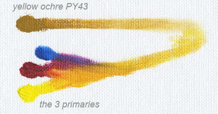
The least expensive way for beginning painters to master colour is to learn to mix colour using the three primary system. Using this system, the student needs only five tubes of paint and most of those colours are a series four or less in the professional grade. In the student grade, colours made by the same manufacturers cost even less.
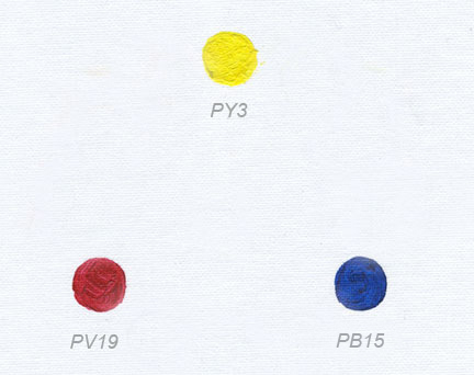
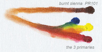
The three primary pigments are : PV19 (red), PY3 (yellow) and PB15 (blue). These pigments are the same used in printer's inks and when combined with white and black can replicate pretty much any colour.
We've asked our Technical Support Champion to demonstrate colour mixing using the three primary colour system. We have also asked le Stig to use "student grade" paint made by Winsor & Newton (Winton) and Art Spectrum (Art Prism). "Student" grade paints use less pigment and more vehicle in ratio than do the professional grade paints. However, the pigments are the same grade as the professional and have the same lightfastness rating. Here are the results:
"I found the two brands of paint to be of good texture and very managable. There was no excess oil coming out of the tube when dispensed on my palette. I found the Art Prism Jaune to be particularly nice in texture.
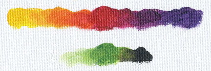
"First, I made my colour wheel starting with the primary red, yellow and blue. On the colourwheel these three are the parent colours for all the others and they are the only colours on the wheel made from a single pigment.
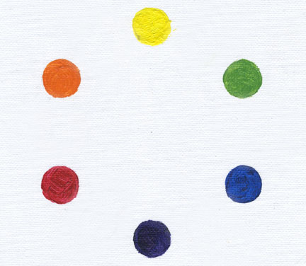
The primaries create a triangle which become the base (parent) colours of the wheel. When each parent colour is mixed with its neighbour, they create a secondary colour. Red mixed with yellow makes Orange. Blue mixed with Red makes Violet and Yellow mixed with Blue makes Green. So, Orange, Violet and Green are the secondary colours, creating another triangle on the wheel.
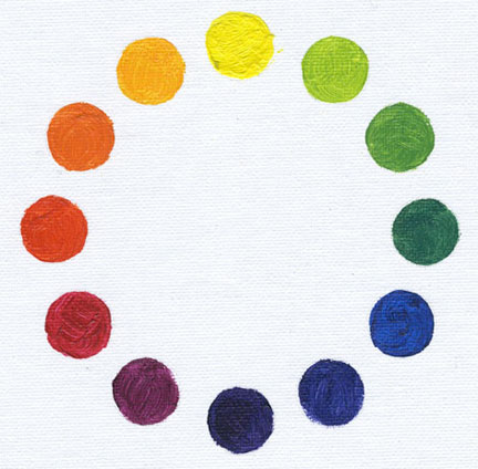
To finalize the wheel, the primaries are again mixed with their new nerighbouring secondaries. This new mixing creates six more colours on the wheel called tertiary colours and complete the wheel. Red mixed with Orange makes the tertiary Red-Orange and Red mixed with Violet makes the tertiary Red-Violet. Yellow mixed with Orange makes the tertiary Yellow-Orange and Yellow mixed with Green makes the tertiary Yellow-Green. Blue mixed with Green makes the tertiary Blue-Green and Blue mixed with Violet makes the tertiary Blue-Violet.
Now the wheel is complete.
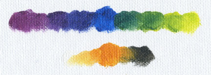
Which now brings us to complimentary colours. Complementary colours are opposites and opposites create contrast, just as light against dark create contrast, but more about that later.
Simply put, complementary colours are located directly across from one another on the colourwheel. For example, Primary Red is directly across the wheel from the secondary Green. This makes them complements (opposites). The Primary Red was not a parent to the secondary green and therefore unrelated. The same is true for Yellow and Violet and accordingly, Blue and Orange. The same is true for the tertiary colours. Red-Violet is directly across the wheel from yellow-green and so on.
Mixing complements neutralize. Therefore, a complementary can be used to mute its opposite. Red mixed with Green can create varying degrees of brown. The same is true when mixing the other two primaries with their complementary secondary.
Colour Harmony
On the colourwheel there exists colour groups (also known as families). These groups are based on the parent primaries. So, there is The Red Group, The Blue Group and The Yellow Group. Colour Harmony is created when one group dominates.
The Red Group consists of all the colours on the wheel that include the Red parent. Red, Red-Orange, Orange, Yellow-Orange, Red- Violet, Violet and Blue-Violet. The complements for this group are any from the green secondary group (Green, Yellow-Green and Blue-Green).
The Blue Group
Red-Violet, Violet, Blue-Violet, blue, Blue-Green, Green and Yellow-Green. Their compliments: Red-Orange, Orange, and Yellow-Orange.
The Yellow Group
Red-Orange, Orange, Yellow-Orange, Yellow, Yellow-Green, Green and Blue-Green. Their complements: Red-Violet, Violet and Blue-Violet.
Complements are used to neutralize; white to tint (lighten), black to shade (darken).
The primary colours are unrelated and therefore can only exist harmoniously with colours that are in their own group or family. Red can only harmonize with colours that contain red, yellow only with colours that contain yellow and blue with colours that contain blue. So, a painting that has colour harmony is one that has a dominant primary group. Good paintings have one or more of three dominant ingredients: Dominant primary group, dominant temperature (warm or cool) and dominant value (dark, light or middle). Contrast is achieved when a dominant ingredient is put next to its opposite. In painting, areas of contrast become focal points, or accents, and are useful in guiding the observer's eye through the painting. So, a dominant colour con be accented by it's complement, a dark painting can have light accents (and vise versa) and a warm painting can have cool accents (and vice versa).
Mixing earthtones
It is possible to also mix earthtones using just the primaries:
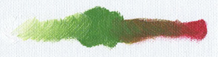
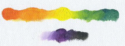
Below are two colour sketches that illustrate dominants and opposites
Daylight
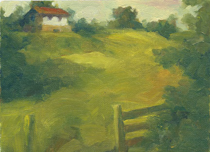
"Here I have used the primary yellow group as my dominant group and green as my dominant colour. I have used colours from the violet complement group to mute and have used red-violets as accents. The area of most contrast in value is the house which becomes the focal point in the painting."
Nocturnal
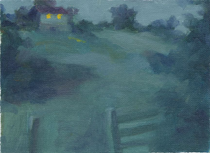
"Here I have used the primary blue group and have muted the blue-violets and blue-greens with orange. I have used the complementary yellow orange to create a high contrast, light against dark focal point. Again, it is the house."
Economical Materials
Canvas panels are an inexpensive support. The Fredrix Canvas Panels are quite good. Canvas pads are another economic option. Another option is Book Board. The board can be sealed with Shellac to make a nice smooth painting surface that is suitable for ala prima (painting done in one sitting) and dry brush techniques.
The econo-palette of Black, White, Burnt Sienna, and Yellow Ochre is good for learning to paint tone and temperature. The portrait below was created using these 4 colours. The substrate is book board with a thick coat of shellac. By placing a mixture of white and black next to an orange, makes the gray look almost blue.
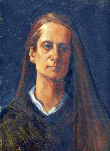
It is a useful palette for learning tonal values, contrast and temperature and understanding value (tone) is a must in learning about colour. Since all colours are a value that exist on the tonal scale that range from pure white to black, it is important that some colours are light in value, some are dark and some mid range values.
Getting Down to Business
Developing Your Style
Artistic Style, like the subtlety in our handwriting, is something that develops over time. It's never forced and just occurs naturally with hours and hours of practical application. With drawing and painting, there is never a shortcut to creating a style; only a long winding road that can take years and years to travel. And just when you think you've finally gotten there and found your voice, it's time to reinvent yourself. It's so important to keep fresh and stay one step ahead and here's why...
Unfortunately, ideas and style aren't protected by intellectual property law and there are always those less talented who will try and copy your ideas and/or your style. The good news is, you're an innovator and copiers are those who are far less creative! Forget the old adage that "copying is the sincerest form of flattery". When artist's ideas and execution are what's bringing home the bacon, it's not very flattering at all.
Avoid the 'One Trick Pony'
So, you've developed an idea and style that's selling and you've decided to to produce "a series"...or three. Are you opening yourself up for failure? Ask yourself, how long will it take for the cheater to catch up and do I have my next idea formulated? Successful artists who make their living making art are constantly raising the bar and reinventing themselves. So remember, stay focused, stay clear, stay true to yourself and stay one step ahead of those less talented.
* * *
Until next time,
Sandy & Jim
Takapuna Art Supplies
www.tasart.co.nz