Hi , welcome to issue #4 of the Tasart newsletter. Our Facebook page is now up and running and we have posted artwork created over the last few (Saturday) Workshops. We hope to create a community where artists from all over the world can share what they're working on, where they are exhibiting, ask technical questions or share tips and techniques. Please join us!(but read our Getting Down to Business article down below first) For more information on our Saturday Workshops and Classes, please visit our website.
Product Spotlight
Clairefontaine Sketchbooks, Pads and Journals

What makes Clairefontaine so special?
Located in the Vosges region of France , Clairefontaine was established on the site of a 16th century paper mill. The Clairefontaine mill has been making paper since 1858 and stationery products since 1890. Clairefontaine is currently the only manufacturer making its own paper for its own products. This guarantees not only consistent product quality, but also controls the environmental impact of the manufacturing process.
Clairefontaine only buys pulp from sustainable forests that are certified according to recognized international standards (PEFC, FSC, etc.) These certifications also ensure that endangered wildlife habitat is protected, worker health and safety laws are kept, and the rights of indigenous communities are respected.
The River Meurthe is the source of water supply for their Vosges mill. The water is so clean when it leaves their facility; local people can fish, swim and boat downstream within sight of the mill.
This month we are offering specials on our entire range of Clairefontaine products.
Getting down to business
Legal rights of artists' works online
-Sean Naden & Sandy Collins
Anything published on the web that is original artwork is protected by copyright. You don't even need to say "copyright, all rights reserved" as you often see at the bottom of web pages. This is actually redundant as all works are by default copyrighted and legally protected by New Zealand law. But, it's always a good idea to place a copyright symbol on the web just as a reminder or to protect you in countries that require the copyright symbol.
If you find images of your work on websites that you have not granted your consent you can email them nicely advising them of their error - in most cases the offender will simply not be aware of the copyright infringement and will usually abide with your request by taking down the image.
Here are a few ways you can prevent people from using your images online without your permission:
Give your images unique names
People using your images on their website will sometimes just drag and drop the image without renaming it, sometimes even sourcing the image directly from your website, so it's a good idea to name your images with unique strings, like MY003DGX7.jpg. That way you can periodically check with Google Images by searching for the exact name of the file.
Use the nofollow,noindex directive
Preventing Google from indexing your web page to begin with is even better as most people who use your images without permission will have found the image using Google Images search. Simply add the robots meta tag to the head of the web pages that contain the images:
<meta name="robots" content="noindex,nofollow" />
Be careful not to add this to all pages on your website if you are wanting images on other pages to appear in Google.
You can also add this to your robots.txt file, if you have access to it:
User-Agent: Googlebot-Image

Disallow: /images/
More from Google here.
Watermark your images
A watermark is an image that overlays your artwork, normally with the copyright symbol. Most cases of copyright infringement on the web involve blogs or articles by non-professionals looking to spice up the visual appeal of their websites, so a watermark is a very good deterrent.
Read The Fine Print
While Facebook, Youtube, Flckr, MySpace or your own Art Blog is a great way to network and promote your art, have you read the fine print? Before singing up for Social Networks and downloading your images for the world to see....or grab, it's a good idea to read all of the terms & conditions.
For example, on the Social Network Facebook under "Terms", it states "For content that is covered by intellectual property rights, like photos and videos ("IP content"), you specifically give us the following permission, subject to your privacy and application settings: you grant us a non-exclusive, transferable, sub-licensable, royalty-free, worldwide license to use any IP content that you post on or in connection with Facebook ("IP License"). This IP License ends when you delete your IP content or your account unless your content has been shared with others, and they have not deleted it.
non-exclusive: open for anyone to use
transferable: to change or move from one thing,, person, place, etc. to another
sub-license: the legal right to use or to re-sell the right of usage
royalty-free: without cost, i.e. free
worldwide license: legal right to use anywhere in the world
Facebook then throws you a bone: If you delete your image/s your license with FB is terminated, BUT, if someone else (someone FB "sub-licensed" anywhere in the world) has used it, the onus would be on the artist to pursue any infringement.
Enough to make you paranoid? Well, chances are, no one is out to steal your intellectual property, but this is "buyer beware" information that every artist should know. Facebook, MySpace, et al, are great marketing tools and they're FREE. Many artists have great success with Social Networking, so have some fun!
Product Review
Le Stig test-drives products & reviews
"A poor craftsman blames his tools."
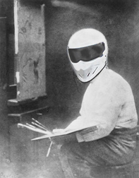
There is so much misinformation and half-truths out there, it can be pretty confusing for the artist. Since the majority of art supply stores in New Zealand own product agencies (which we do not), we've decided to commission a 'tester' who will test products and give unbiased opinions and results. This month, our 'Technical Support Champion' performed a comparison using only the primaries of four leading brands of acrylic paint sold here in New Zealand. Here are the results:
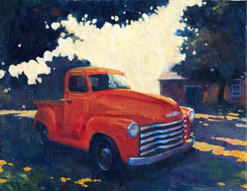
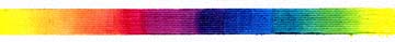
First, our TSC tested Liquitex because it's the granddaddy of water based artist acrylic paints. Founded in 1955 Liquitex has been a main stay for artists all over the world and has consistently set the benchmarks to which other manufacturers aspire. Le Stig told us, "When I attended the atelier Liquitex was the exclusive acrylic paint. So much so, that the name 'Liquitex' was synonymous with acrylic paint as was 'Xerox' with photo copying machines and 'Hoover' with the sweeper." Our Champion began his test by blending the manufacturer's recommended primary colors into a spectrum strip on canvas. He then made a painting using just the primaries plus Titanium white and Mars black. "The paint preformed exactly as I expected. It mixed easily on the palette and canvas. The paint can be diluted with just water and blends with a minimal amount of streaking. I chose to paint a portrait of mon ami Kim's truck with the Liquitex and was pleased as always with the performance of the paint. The neutral colours were achieved easily by mixing compliments and a variety of dark and light tones were accomplished by the addition of ether black or white. Facile!"

Next, le Stig chose to test Matisse Artist Acrylics because this Australian manufacturer was established in 1964. When asked, our champion confessed that he'd not used the paint before and looked forward to testing it. Again, our tester was supplied with only the recommended primary colors which in the case of this manufacturer are tubed and labeled as: Primary Yellow, Primary Red and Primary Blue. Again, the TSC created a color spectrum strip and a subsequent painting. " I found this paint to be superb in texture and quality of colour. It mixed beautifully in every way and was very creamy in texture while mixing. Tres facile, but perhaps, made more so by the addition of Titanium white to the yellow and the bleu. The paint handles superbly!"
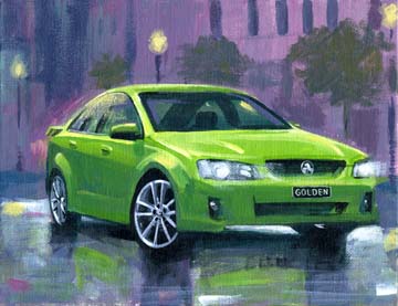
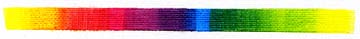
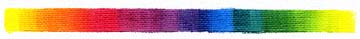
Thirdly, our TSC was given the primaries for Golden, and like Matisse, Golden has labeled tubes of "Primary Yellow," "Primary (Magenta) Red" and "Primary Cyan Blue," and these colors were used to make the spectrum strip and subsequent painting. Golden has only been on the market for artists since the 1980's and has taken major steps in promoting the paint as a viable artist quality acrylic. Le Stig says, "This paint preformed excellently and the primary colours were easy to mix due the addition of Titanium white into the yellow and bleu. I found it to be very much like the Matisse brand as both are creamy in texture and easily managed on the palette and canvas."
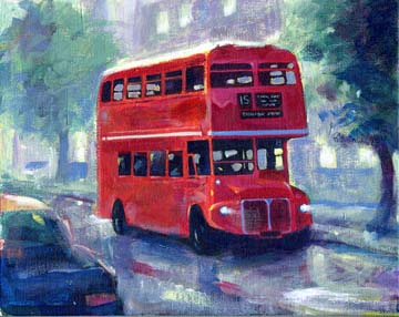
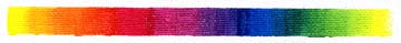
Finally, our TSC tested the new Winsor & Newton Artist Acrylics and was impressed by the intensity of the colors. "The Winsor & Newton are the most vibrant of the four brands. Possibly it is due to the clear binder that Winsor & Newton has developed for their new paint. The paint preformed as well as the other three brands. The recommended primary colours blended easily to create a nice spectrum and the paint mixed easily on both the palette and canvas."
Our champion was equally impressed with all four brands of paint and would only choose one over the other for a color that is brand exclusive such as the Liquitex "Parchment" or the Matisse "Australian Salmon Gum."
Liquitex
The Good
- A high performance paint with an excellent colour range.
The Bad
- The tubes are beautifully designed but lack a swatch of actual colour.
The Ugly
- There is nothing ugly. Liquitex is a classic like the 1955 Thunderbird.
Matisse
The Good
- Excellent and unique colour range of quality paint. The tubes have a swatch of the actual colour on them. The 75ml tubes give you more value per purchase.
The Bad
- None
The Ugly
- None
Golden
The Good
- Excellent range of high performance paint. A swatch of the actual colour on the tubes
The Bad
- No tubes larger than 59ml
The ugly
- Golden is the Holden of artist acrylics. A fast and flashy Ford wannabe.
Winsor & Newton
The Good
- A much improved line of acrylic paints made by one of the most revered manufacturers of artists' materials. Excellent value. The clear binder minimizes color shifting. Swatch of actual color on the tube.
The Bad
- None
The Ugly
- None
Happy Painting!
* * *
Until next time,
Sandy and Jim,
Takapuna Art Supplies
www.tasart.co.nz