Hi , welcome to issue #8 of the Tasart newsletter. Great news! The Workshop is running again starting this Saturday (9th of April) and apart from Easter Saturday, will continue until further notice. The tutored classes will also resume the first week of May and you will find all the info. on our Classes Page. Some recent feedback is that some of you don't like to use Facebook so I promise to be better at updating our blog, where you can access some of the artwork created in The Workshop without having to log in or sign up for anything.
Also, we really appreciate all the feedback we get regarding our newsletters as it truly does motivate us to make them informative and fun. Thanks to all the tutors who have stopped by the shop and told us that they refer their students to our newsletters and encourage them to come into the shop for advice. We do have our Newsletters archived on our website if you want access to any that you may have missed.
We also are happy to see that some of our Christchurch customers are back drawing and painting again!
Congratulations to our staff member, Julie Freeman, who won a highly commended award at the latest PANZ National Competition. This is her third national award for pastel painting.

Product Spotlight
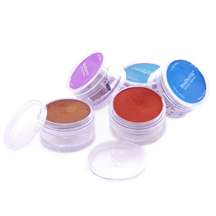
Save 20% on PanPastels online
PanPastel Colors are genuine artists' quality pastels, uniquely packed in a pan format; available in a range of 80 colors.
PanPastel Colors were developed so that artists can easily lift, apply and control pastel color, just like true painting! The pan format holds the color like paint for easy application. Loaded with the highest quality artists' pigments; PanPastel Colors are made using a unique manufacturing process requiring minimal binder and fillers, resulting in a rich, ultra soft and low dust formulation. All of these professional quality colors are highly pigmented, have excellent lightfastness and are fully erasable. Each pan contains 35%* more material than the average pastel stick. PanPastel Colors are fully compatible with traditional pastel sticks, pastel surfaces, conventional fixatives and other artist's colors. Not only do Pastel Artists love them, we are finding that Scrapbookers, Journal Makers and Encaustic Painters are discovering them.
*Average, based on a survey of leading brands.
We will continue to special PanPastels on our website until further notice. For a quick reference of all our online products on sale, please visit our Specials Page.
FAQ's About Professional Artist Grade Paints
What's the best brand of quality artists' paint?
There isn't a "best brand". In order to succeed in the highly competitive artists' paint market the prominent manufacturers go to great lengths and expense to secure the finest pigments and vehicles for their brand. So, the leading brands are considered to be on par. We advise our customers to test and compare the various top brands in order to find the paints that suit their individual needs regarding style and technique.
Can I mix brands or should my palette be made up of one brand?
Brand name professional quality paints are usually compatible and easily mixed. While manufacturer cautions and limitations should be observed, most professional brands of oils paints are highly compatible with one another. And, the same is true of the professional brands of acrylic and watercolor paints. Most acrylic brands are compatible with other acrylics, also the majority of watercolor brands are compatible. Since some brands make professional paints that have specifically formulated properties (i.e. fast drying Alkyd oils or slow drying "open" type acrylics) we recommend that testing be done to determine the extent of compatibility and if the mixture suites the artist's style and technique requirements.
How do I know if I'm buying quality paint?
There is an internationally accepted minimum standard of specifications for quality paints. This system for standardization was developed by the American Society for Testing and Materials (ASTM). ASTM International Standards require that quality paints pass a series of performance tests, meet physical property requirements and provide an official pigment nomenclature. There are labeling requirements set forth by the ASTM with which manufacturers must conform. Foremost, labels must show conformance to standards for the "Practice for Labeling Art Materials for Chronic Health Hazards (ASTM D 4236). Every label must have the common name(s) of the color on the front and a list of pigments that combined, make a specific color. For example, "Paynes Gray" is a mixture of the common name colors "Ultramarine Blue" and "Ivory Black" and those two pigments, PB29 (Ultramarine Blue) and PB9 (Ivory Black) must appear on the label. The appropriate lightfast category must appear on the label and when substitute pigments have been used the word "Hue" must follow the common name on the front label. Vehicle information must also be included. Artists' oil paints must name the vegetable origin of the oil used, the method of refinement and any types of resins or gums that may have been used. Artists' acrylic emulsion paints must identify the polymer. Standard weight information, any other appropriate statements of conformance, the name and address of the manufacturer (or importer) and the country of manufacture are also required.
ASTM International approved pigments are indexed by name and number.
Example:
Pigment White 4 or PW4
Common Names: Zinc White, Chinese White, Permanent White
Index color group names and abbreviations:
- Natural Red (NR)
- Pigment Blue (PB)
- Pigment Black (PBk)
- Pigment Brown (PBr)
- Pigment Green (PG)
- Pigment Orange (PO)
- Pigment Red (PR)
- Pigment Violet (PV)
- Pigment White (PW)
- Pigment Yellow (PY)
The number that follows the name or abbreviations indicates a particular color within that color group. For example: Pigment Blue 35 (PB35) is Cerulean Blue an inorganic synthetic made from Cobalt Oxides.
Fun Facts
Pigments are numbered in chronological order; determined by when the manufacturers started using them in artists' paints.
There are only 3 White Pigments suitable for paint and one is not available in New Zealand. The only two available for resale down here, are Titanium White (PW6) and Zinc White (PW4). All other whites available are a combination of PW6 & PW4.
Henry Levison, founder of Permanent Pigments, invented artist acrylics in 1950 and his Liquitex Acrylics were the catalyst for listing ingredients and "lightfastness" on their paints. Chairman Mark Gottsegen of the ASTM states "No one had done this before. Levison was responsible for bringing together paint manufacturers to the ASTM table because it was the right thing to do." Liquitex founder, Henry Levison was also one of the founding members of the National Art Materials Trade Association, according to Gottsegen, "A Maverick in his field."
Old Holland, the oldest manufacturer of Artist Oils (1664), purchased the world's supply of the Manganese pigment (PB33), and has enough to make this paint color for the next 100 years. This is why other manufacturers can only produce a Manganese Hue (which is derived from Cerulean).
Winsor & Newton were the first manufacturers of moist watercolours way back in 1835.
And, le Stig's favourite:
Matisse Red Light, PR254 Pyrole Red (a newer pigment!), is the same pigment that Ferrari uses for its red. ("eeze tres lightfast")
Le Stig test-drives products & reviews
"A poor craftsman blames his tools."
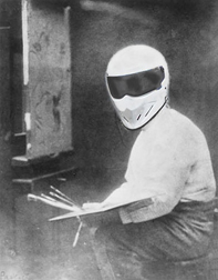
There is so much misinformation and half-truths out there, it can be pretty confusing for the artist. Since the majority of art supply stores in New Zealand own product agencies (which we do not), we've decided to commission a 'tester' who will test products and give unbiased opinions and results. This month, our 'Technical Support Champion' performed a comparison using only the blacks and whites of the leading brands of paints sold here in New Zealand. Here are the results:
We asked le Stig
Which white should I use?
"That depends on what you want to achieve. There are only three white pigments and all three are inorganic synthetics and considered to be opaque."
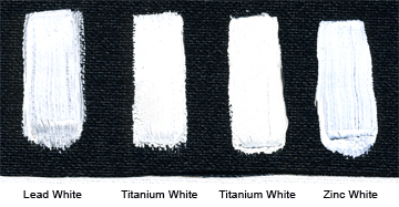
"Lead White (PW1), also known as Flake White, Cremnitz White and Silver White is one of the earliest artificially manufactured pigments recorded and is not readily available in New Zealand due to extreme toxicity. The Old Masters used this stuff because it was the only pigment available and it was good for mixing with black for under paintings that would be eventually covered with glazes. The cool thing about this white is that it doesn't change the warm temperature of blacks. Le Stig happens to have some stash of Cremnitz White which I will use to demonstrate."
"Titanium White (PW6) also known as Titanium Dioxide is the most recent white pigment and the most opaque. It is very dominant when mixed with other colors and produces bluish grays when mixed with black."
"Zinc White (PW4) is also known as Mixing White, Transparent White, Chinese White and Permanent White. It's a little more transparent than Lead White and very cool in comparison when mixed with black."
Which black should I use?
"Again, that depends on what you want to achieve."
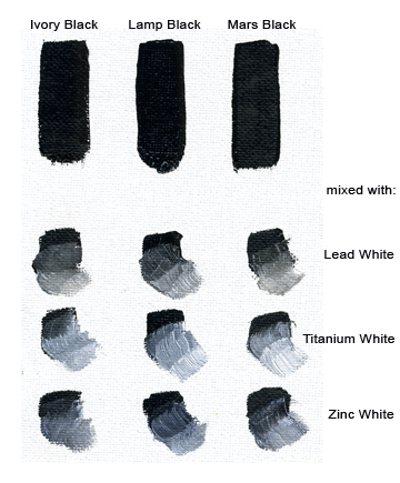
"Carbon Black (PBk9), also known as Ivory Black and Bone Black is an impure carbon black made by charring animal bones. It's also slow drying, but the most widely used black by artists."
"Carbon Black (PBk6), also known as Lamp Black or Vegetable Black is the oldest black pigment known to man and made from burning oils, etc. Its slow drying rate makes it inefficient when mixed with white as an under painting."
"Black Iron Oxide (PBk11), also known as Mars Black is very opaque, brownish in undertone but faster drying that the carbon blacks."
There are other black paint names and they will vary between acrylic paint, oil paint and watercolour. The blacks above are the most widely used.
There also many ways to make more exciting blacks using color (see below) and we will get into those in a future newsletter.
Down below, le Stig made a traditional "grisaille" which literally means "gray picture" using Titanium White and Ivory Black, the most popular White and Black used by modern artists. He found them to be "satisfactory but prefers to use burnt sienna and white as underpaintings in this traditional fashion as this combination doesn't muddy-up the glazes"
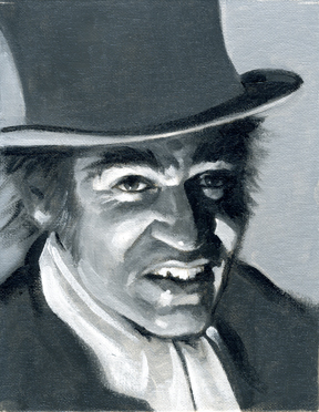
In the next Artist's Newsletter, le Stig will do the glazing on "Monsieur Hyde".
Getting Down to Business
We've been enjoying the exchange over the last few months between the band Kings of Leon and the Creator/Producer of the hit television show Glee, Ryan Murphy. For those who haven't been following, Murphy asked Kings of Leon if they could license their song "Use Somebody" in the television show Glee. The answer was a resounding expletive [deleted] "NO!". Murphy's response was that the band were selfish ["deleted"]. They should be encouraging young people to join glee clubs and the "exposure" on the show would be good for their career.
We think, in spite of who's side you're on, the artist has the right to protect the moral rights and the integrity of their work and how it's used. No matter what. Some entities push artist's to use their art for all types of promotion, but artists need to ask themselves who is really out to benefit.
Plus, it is possible to die from "exposure".
* * *
Until next time,
Sandy & Jim
Takapuna Art Supplies
www.tasart.co.nz